So What Can The Intern Do Then?
In my previous post, I poked fun at people who don't understand what developers do and want to loudly proclaim that AI has already replaced, or is months away from replacing us. I still think that's completely ridiculous, and honestly it would be amusing if it didn't betray just how little some people know about Software Development.
Now you might have read that post and decided "Old Man Rusty hates AI!". And you'd be wrong. Don't get me wrong I don't love that some Silicon Valley elites hoovered up the worlds data without asking, and then set some power grids alight using it all. I don't love the ethics of these companies. I don't love their attitudes. I don't love just how much money and resources are going into all of this based solely on hype and dreams. I don't love that their answer to all the critiscm is "yeah but in 6 months AGI which will solve all the worlds problems!". Buuuuuuuut. And yes, it's a big buuuuuuuuutttttt. If you want to put all that aside (and mad respect for you if you don't) the annoying thing about it all is that this isn't Crypto 3.0. There is actually some kind of useful tool here for people in my industry. They haven't just invented the worlds slowest, most expensive to run and useless database you can put links to JPEGs on.
So if I don't think it can replace me, and is nowhere near replacing me, is it still useful? In my experience, yes! I use a combination of Codex and Gemini CLI regularly to help me get work done. Before you ask I can't afford Claude, I am but a poor humble small time developer and those two are just cheaper (yes I know, heavily subsidised, but again this post isn't about the negatives). What it's great at might seem a bit confusing at first. It's great at the very obscure, detail orientated very small things. For example, you have an unsymbolicated C++ or Swift crash log. I don't care how much industry experience you have, 95% of us have NFI how to decipher one of those, and the other 5% are liars. We often struggle even just to symbolicate them. LLMs don't. They excel at language tasks, and this dear reader, is another kind of language. They can read it very well. They can interpret it, and they can then tell you what probably caused the crash and where it is. That is, to put it bluntly, insanely useful. What might have taken me hours, is now minutes. Great! Or you want to convert Objective-C code to Swift code, guess what, great at that too because it's another language based task.
Now ironically, it's also very good at the big wishy washy things. You might think that's counter-intuitive but it has so much training data that creating something which looks kind of like what you want isn't hard. Again, it's other great skill is imitation. You show it a picture of an app, it can make something like that very quickly, ignoring the details and rough edges of course. A few months ago we wanted to build a vocoder at Bjango, but we had no experience in doing that. We wanted to know if it was even possible, and if so how. So we prompted some LLMs and then later that day we had a working prototype. Working is very generous here, it didn't actually vocode, but it showed us what we wanted was indeed possible and we just had to work through it. Marc and I gave a presentation about it if you want to learn more. We ended up spending 3 months re-writing everything the AI did, but it was insanely useful to have the way forward illuminated.
The other example is more recent. I know nothing about neural nets and machine learning, but there was a project we are considering doing that needs me to learn this. So again, I turned to my LLM friends who've hoovered up the worlds data about these processes and got them to get me 70% of the way there. They explained about TensorFlow and PyTorch and Epochs and Losses and training data and so much more. I could have found all that on my own, but to have that knowledge to draw on and get me close enough to a working prototype for me to do the rest on my own was invaluable.
It's also useful if, like me, you work alone and you don't have any other humans to do code reviews or talk through problems. You can get an LLM to do that and it imitates a developer well enough to get you to realise where you might have made a mistake or where you might have gone wrong. They are also trained to be insanely upbeat, which while sometimes annoying can be a nice change from dealing with real humans.
It's also useful for what I call "fun stuff". Things that you will only use personally once or twice and you don't care about the code quality. Or things where you want to prompt an LLM into building you a fully working prototype of an idea before you go and replace everything it did with your own code. Move this up. Change this screen. No lets try linking this to this. Ok that's no good give the image a gradient fade. And so on until you get what you want. You'd be surprised how easy production ready code is to write once you have taken the time to actually prototype something and work through all your ideas.
Finally and more soberingly I know some people out there are actually using it to do their job, managing agents, scheduling tasks, performing reviews and getting it to submit code to production for other people to use. To those people I want to say two things. One is I see you, you've found a new toy and you want to see just how fast it goes, I get it. In the opinion of this humble author though, one day you're going to slam that shiny toy right into a tree. Might not be today, might not be tomorrow, but one day it's going to come back to bite you. If you're shipping code at a velocity where you don't understand it and you're not actively working on it don't forget that ultimately you're the one responsible for the outcomes. When someone can't get part of your app to work because an LLM decided JSON was an amazing storage format for indexed, sortable data. When you leak all your customers personal details to the internet. When things break and the bots just can't fix them without breaking more things...well...that's all on you. And that, dear reader, is why the title of this post is what it is. Treat everything that comes from an LLM as if the intern that just started this week did it. Double check it. Triple check. Don't assume anything it told you is true, because that's the actual job you're paid to do.
AI Developer Challenge
Ok, I've had enough. The hype train around AI is just writing cheques the technology simply cannot cash. I'm not saying it doesn't have its uses, it does. Please don't read this post and hear things I'm not saying. I'm just fed up with the "AI is inevitable, developers are out of jobs in 2026" crowd. I didn't jump up and down saying all lawyers were out of jobs when an LLM passed the bar exam. I didn't say journalists and writers were doomed when an LLM could write something that soundly vaguely like a journalist would. Why? Because I recognised there was a massive delta between imitating a journalist/writer, and actually being a one. That's called nuance, I'm hoping the Internet learns about it one day.
A lot of people seem to think that if the code compiles that the job is 90% done. The truth is, writing code that can compile and pass a test is literally only maybe 10-20% of my job. If the goal was simply to write something that could compile and pass a test, yes, I would indeed hand in my badge and go find a beach to retire on. If the job of a laywer was to pass a bar exam, they too would all retire. If the job of a journalist was to put the right amount of paragraphs into articles, they would too. That simply isn't how development, lawyering or writing works. Allow me to explain via two examples.
Let's start simple. There was a crash in Robot Rocket that a customer sent in. It was an unsymbolicated C++ crash so I turned to Gemini CLI to try and help me diagnose it. I told it where to find the crash ips file, what the issue was and that I wanted to know which part of my code might be responsible. In about a minute it figured out the exact line, and offerred a fix. It wanted to add a null check in front of a null variable to fix the crash. And dear reader, that would indeed have fixed the crash. Job done, right? Wrong. That's literally what I'd expect out of a developer fresh out of the education system and in their very first day at work. Because as any half decent developer knows when a crash occurs your job isn't actually to fix it. It's to determine why it happened, and what the correct way to fix it is. The code crashed because you didn't anticipate something. In this case I wrongly assumed that a method called "initialize" in an API would be called before other methods, and I was wrong. In other words, just adding a null check was ignoring the fact that the method it crashed in was setting up some configuration on an object. If you just add a null check, guess what, no configuration and suddenly you have introduced a very subtle bug that will take you much longer to find. This would lead to someone saving some important config for say a live gig with your app, opening it at the gig, and not realising half their config might not have been loaded properly. Now could I have sat there prompting an LLM into fixing it properly, sure, but I bring this example up for a reason. The LLM isn't a developer. It doesn't think like one. It doesn't have enough context to reason properly through complex projects and what the implications of making changes truly are. It's only good at imitating what a developer does.
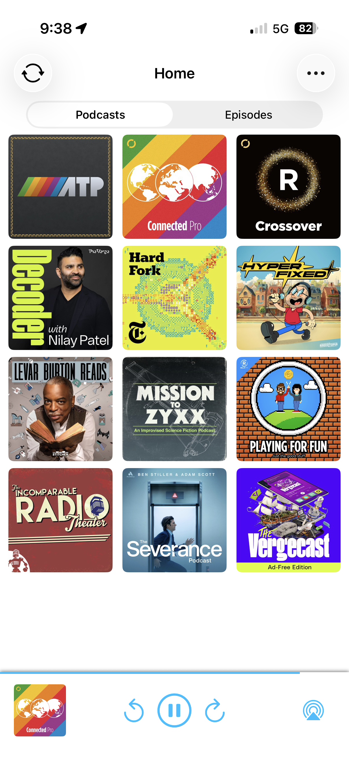
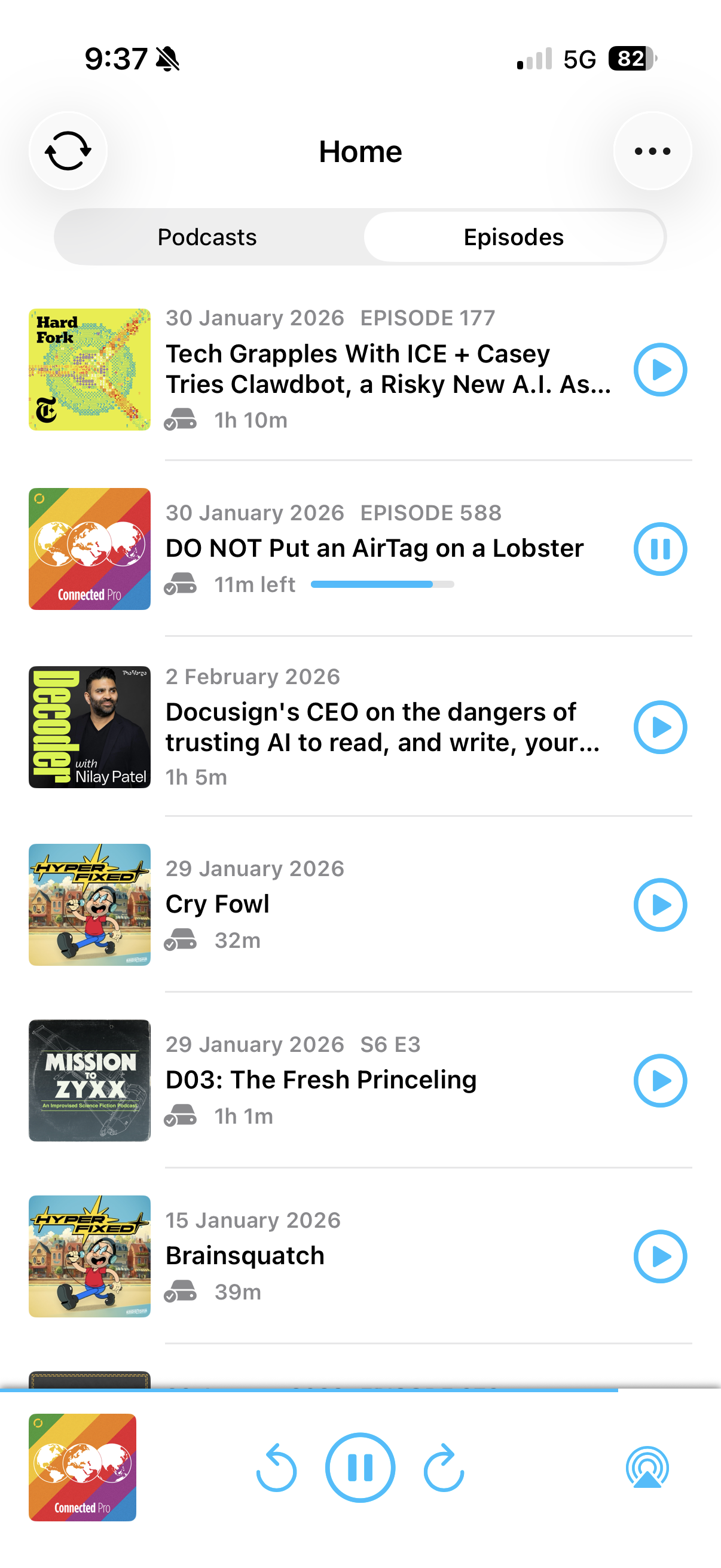
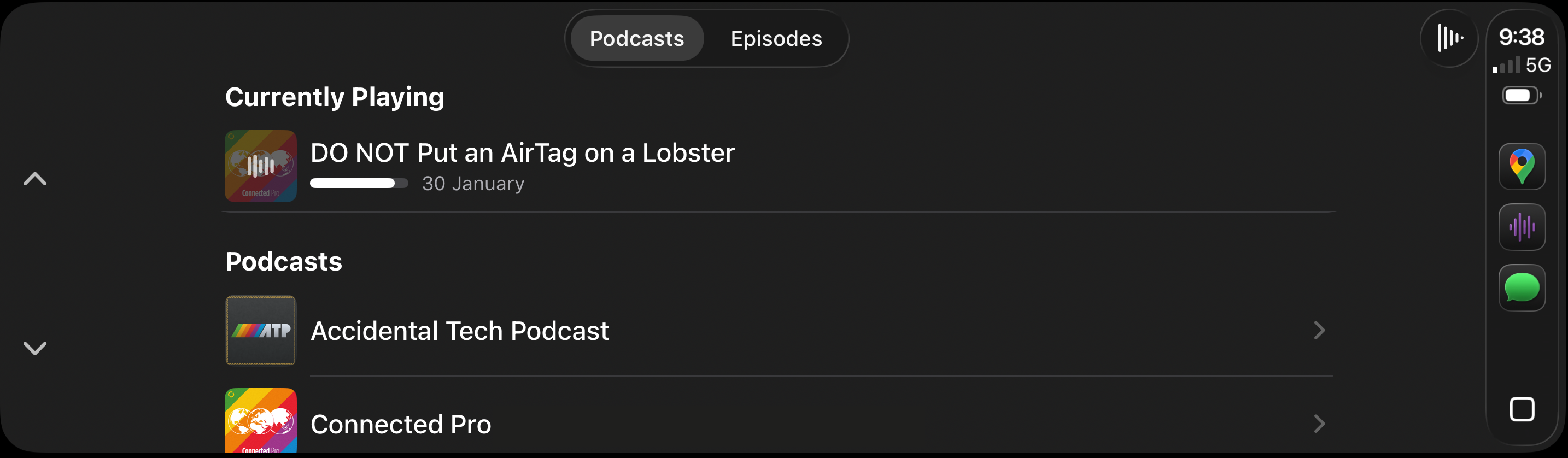
But enough simple examples, let's go concrete. A few years ago I wanted to build my own simple podcast app, for just me. I wanted to be able to add podcasts, have their episodes sorted nicely in a list and be able to play them easily at any time. I wanted to support streaming and download. I wanted to support CarPlay. I wanted it to be so simple and bullet proof that I'd never have to think about using it. So I sat down and over the space of a week or two I coded it up. I've used it ever since and it has indeed been bullet proof. Maybe once or twice a year I might clean something up or tweak something but after those initial 2 weeks I haven't significantly changed any part of this app. It's just worked the way I wanted it to.
And isn't this exactly what the AI hype train is promising? That the AI is now good enough to do exactly the above. To replace me, to be a developer. So if that's true, here's my challenge: I want you to build an app like this for yourself. I want you to prompt (no coding allowed) your way to a fully featured podcast app. I'll even give you mine as a template:
It's a super simple 2 tab design. The first tab shows all the podcasts you've added:
 </p>
</p>
The second tab shows your episodes:
And finally there's the CarPlay integration, again, not complicated:
And if you manage to get to a fully featured, bug free app that does all of the above and you love using each and every day then I will be forced to admit that LLMs are far more capable than I am giving them credit for. Again, don't hear what I'm not saying. I don't care if you get 70% of the way there and it looks kind of like my app. That's not impressive, that's an LLM imitating what I did, not actually doing it. I want a 100% complete and working app. And I want it to be built by a non developer. Someone who doesn't really know how to code, but knows how a podcast app should work. Because that kind of person would be able to hire a developer and be able to reproduce the above. So if the LLM is now good enough to be a developer, and replace one, then it should be able to do this without any issues.
If you've managed to do that, please reach out to me on Mastodon and claim your trophy. After all, perhaps I'm just holding it wrong?
Robot Rocket
We just released our Vocoder plugin, Robot Rocket to the world. TL;DR: you can download it here.
For a slightly lengthier introduction about what we did and why, Marc Edwards and I gave a talk at Dev World 2025 about it, which you can watch here on YouTube.
If you're at all into audio plugins or just want to support us, please, check it out and consider buying it. It's a once off purchase for something you can keep in your audio arsenal forever.
Also, it looks pretty damn cool:


Legacy Automakers?
I've owned quite a few EVs, starting with a Tesla Model S I bought in 2018, back when it was that or an imported Nissan Leaf as your choice of EVs in Australia. Then my wife got a Polestar 2 and I later downsized to a Model 3 when that became available.
As a Tesla owner back then all I kept hearing was about how superior Tesla's were, how they were 10 years ahead and "legacy automakers" would never catch up. And I believed it too, the Model S was my first ever brand new car. My previous VW Golf was made in 2009, it had cruise control, and that was about it. So when I got into the Model S for the first time, it really did feel like the future. From the clean interior, to the massive touch screen, to all the driver assistance features...well, it kinda blew my mind. And so I internalised "Tesla's are the best, no one else can make a good EV, har har isn't that funny frunk goes up!"
Quick aside: even back then I didn't like Elon. He wasn't a proud right wing fascist, but it was obvious he was an idiot who steam rolled the actual engineers he was working with to claim their achievements as his own. I won't pretend I knew the extent to which he was messed up, but I did buy two Tesla's despite him, not because of him. I wouldn't buy one today not only because I disagree with his entire political stance, but also because I wouldn't trust Tesla to still be honouring warranties in 5 years time. It's a volatile company, run by a mad man, if you want to trust them with your life and your wallet, you do you I guess.
Enter The Wanker
Then in 2023 my wife and I went to an EV expo here in my home town of Adelaide, and we sat in, and test drove some amazing EVs. It had been a slow build up, but this was the moment I can pinpoint where I finally realised all this "legacy automaker" nonsense was just that, nonsense. Lots of companies build comparable and better EVs than Tesla. The BYD range was more affordable. The Hyundai and Kia ranges were impressive. Every single car we sat in or test drove blew us away. But most surprising was the BMW range. We test drove an iX3 and my wife instantly fell in love. It was smooth. Spacious. Someone actually thought about every aspect of the interior and driving experience and took the time to make them good. The accelerator mapping, the blended regenerative braking, the cruise control and so much more where just plain better than what Tesla had to offer. Sure you can point out the "on" button and lack of frunk and scream about how legacy automakers don't get it, but all the frunks I ever had were, in practice, very annoying to actually use. I think these legacy automakers actually know how to build a good car. Shock. Horror.
And so a short time later prompted by financing arrangements, the knowledge a new Model 3 was imminent (+me not wanting a Tesla in our lives anymore), and a deal being available on a used iX3, we pulled the trigger. I'm not much of an SUV guy, but the car really impressed me. The app was surprisingly good, the driving experience excellent and though the range was slightly shorter than what I was used to we still took it on a 2000km+ road trip with no issues.

Later that year after test driving one, I ordered a BMW i4. At this point we'd sold the model 3, Michelle was driving the iX3 and I had the Polestar. The wait time was around 12 months and I knew that would coincide with the financing arrangement we had set up. Without going into details, we'd decided to stop short term financing cars and go for a much longer ownership period. So as wanky as it sounds I had to pick my "forever car".
During the time between order and delivery (which was cancellable), I test drove and went to look at quite a few other cars. I figured if I was going to be the wanker picking a forever car, then I was going to wank it up real good. Ok, not the greatest turn of phrase, but I think you get it, I'm embarassed about being able to afford any of this and trying to deflect that with some poorly placed humour.
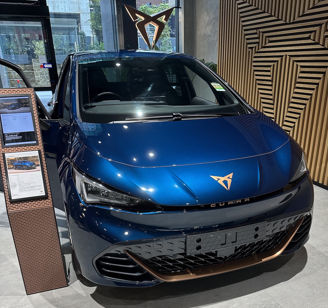
Cupra Born
I love little hatch backs. This car just looks so damn cool. I didn't like the drive though and a lot of the features it shipped with hadn't been approved for Australian use yet (no phone key, no connected infotainment, etc). Also my kids are giants, and they would struggle to fit in the back. I suspect the next iteration of this car will be amazing, but this one wasn't.
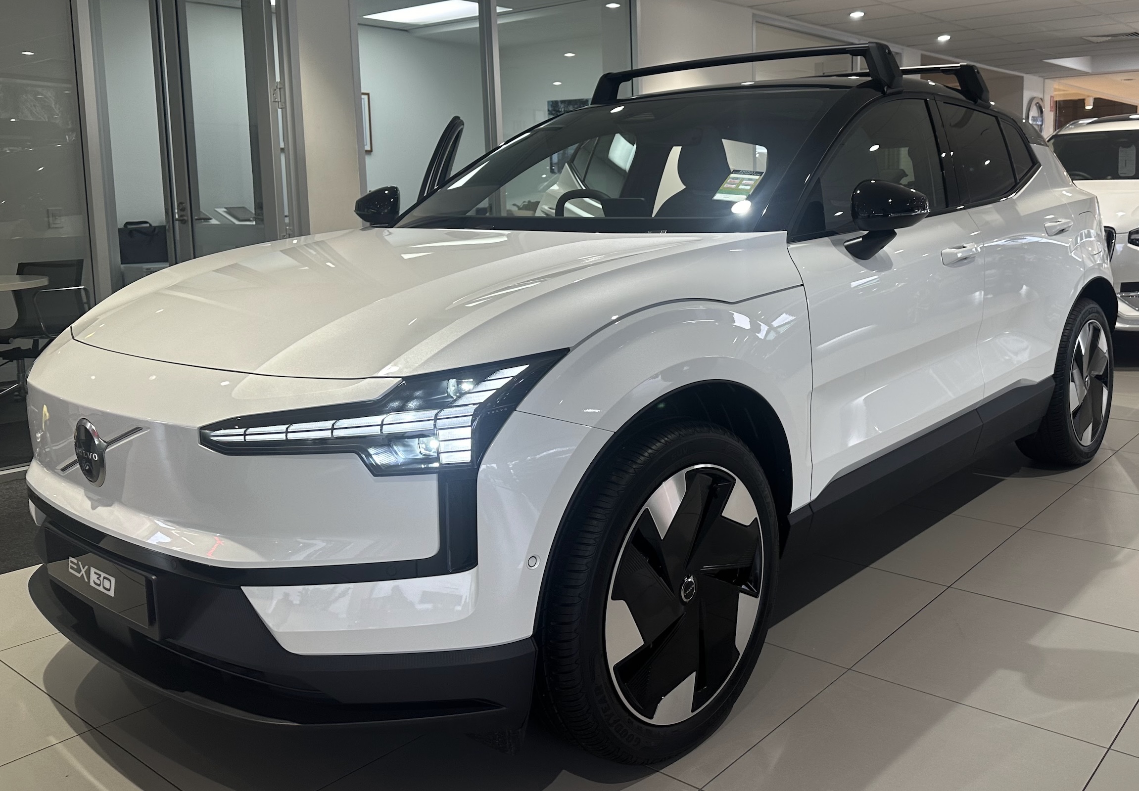
Volvo EX30
Not quite a hatchback, but feels like one. I checked out quite a few and got a demo of the infotainment system. I almost bought one, but the back seat room and some worries about how reliable the Android Automotive infotainment system was in the early reviews put me off. Also not a single button in sight, which felt like learning the wrong lesson from Tesla. Still, probably my second favourite EV after the i4, definitely worth checking out.
The Others I Perused
- Hyundai Ionic 5: love the look, way too big in practice.
- Kia EV 6: same, too big for my needs.
- Polestar 3: too expensive, too big, but hot damn, I like the look.
- Polestar 4: too wide...this car is 2 metres wide?! Also pricey and similar concerns about the infotainment system as the EX30 and the reliability of the back camera as your only way to see out of the back.
- Nissan Leaf: too expensive new (for what it is) and the older ones just aren't that nice. Also chademo plug instead of CCS 2 (which is the standard here in Australia for everything except a Leaf).
So in the end, I kept my order with BMW and waited.
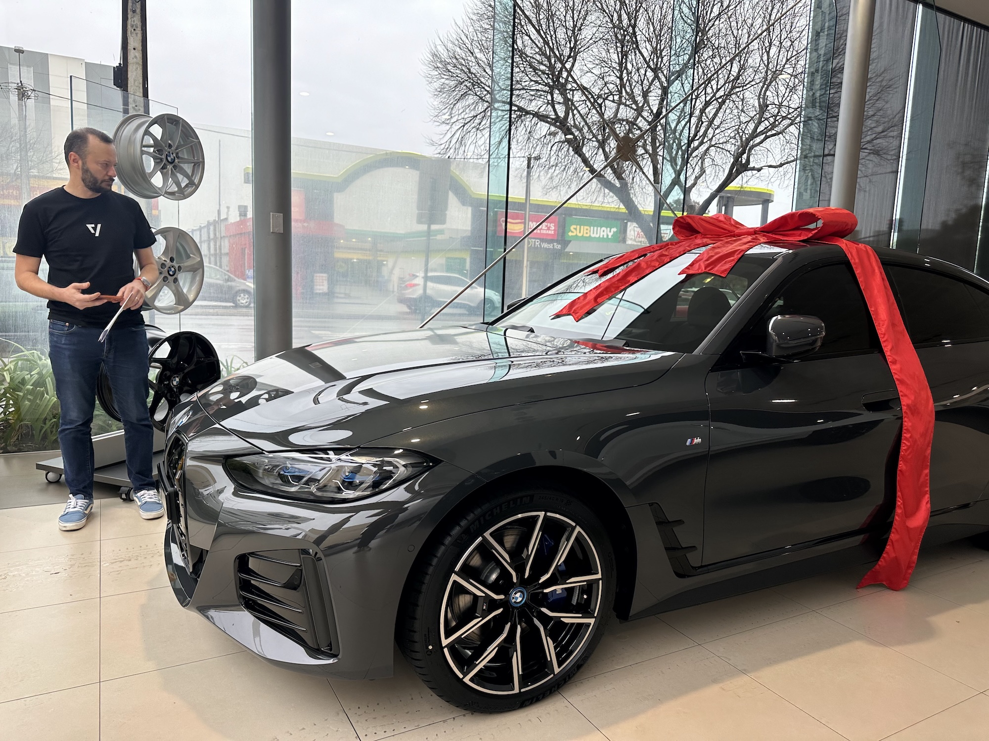
I mean just look at how happy I am! Ribbons are really my jam! I love car dealerships! I know how to smile on camera! No you're hiding the kidney grill from this picture!
You can watch a million reviews online from people more qualified than I, but I will say that this is, hands down, the best car I've ever driven. It's comfortable, it feels effortless to drive. The cruise control and lane assist features work really well. The range is amazing. And for the nerds out there, the app is really good. The only gripes I have is that it doesn't show charging speed while charging (even though the car has this info on the dash) and that it can take up to 30s to send the car a remote command (like start the air conditioner, unlock the doors, etc). I suspect that last one is a feature, not a bug though. Unlike a Tesla you can leave the car somewhere for 2 weeks and you'll come back to pretty much the same state of charge you left it with. My Tesla's used to shed 1% a day pretty reliably.
The model I have has Apple's car key feature (the NFC version, not the UWB version) and that is rock solid reliable. You do need to make contact with the door and place your phone on a pad to use it, but it works even when your phone goes flat (the NFC stays powered on for a while) and has never failed me. It hands down beats both the Polestar phone unlock and Tesla's for reliability. Of course it comes with a regular key fob as well, but once you get used to not carrying keys it's hard to go back.
Infotainment wise one screen runs CarPlay, which works very well and the other one has all your speed and driving information. There's a heads up display, which while it looks a bit 90s is super useful in practice. The vents are physical (thank Zeus) and there are just enough buttons for things you use regularly that the touch screen isn't an issue. The actual BMW software is pretty good, though the "Apps" screen is one place they learnt the wrong lesson. Splitting all the cars functions into 30 or so apps isn't hip or trendy, it's just annoying. Once you've configured the car though, you don't really ever go back there. The car has driver profiles, which work well (remembering all your preferences, seating position, etc) though why it takes 10+ seconds to switch between them is a bit baffling.
A year later, apart from the steep price, I have no regrets, this really feels like a car I can drive for 5-10 years without issues. The point of this post isn't that you should get an i4, it's more that pretty much everyone is making good EVs now. If you're in the market for a new EV, you can and should do better than a Tesla. Even in Australia, the choice of cars in all sorts of price ranges is now quite impressive.
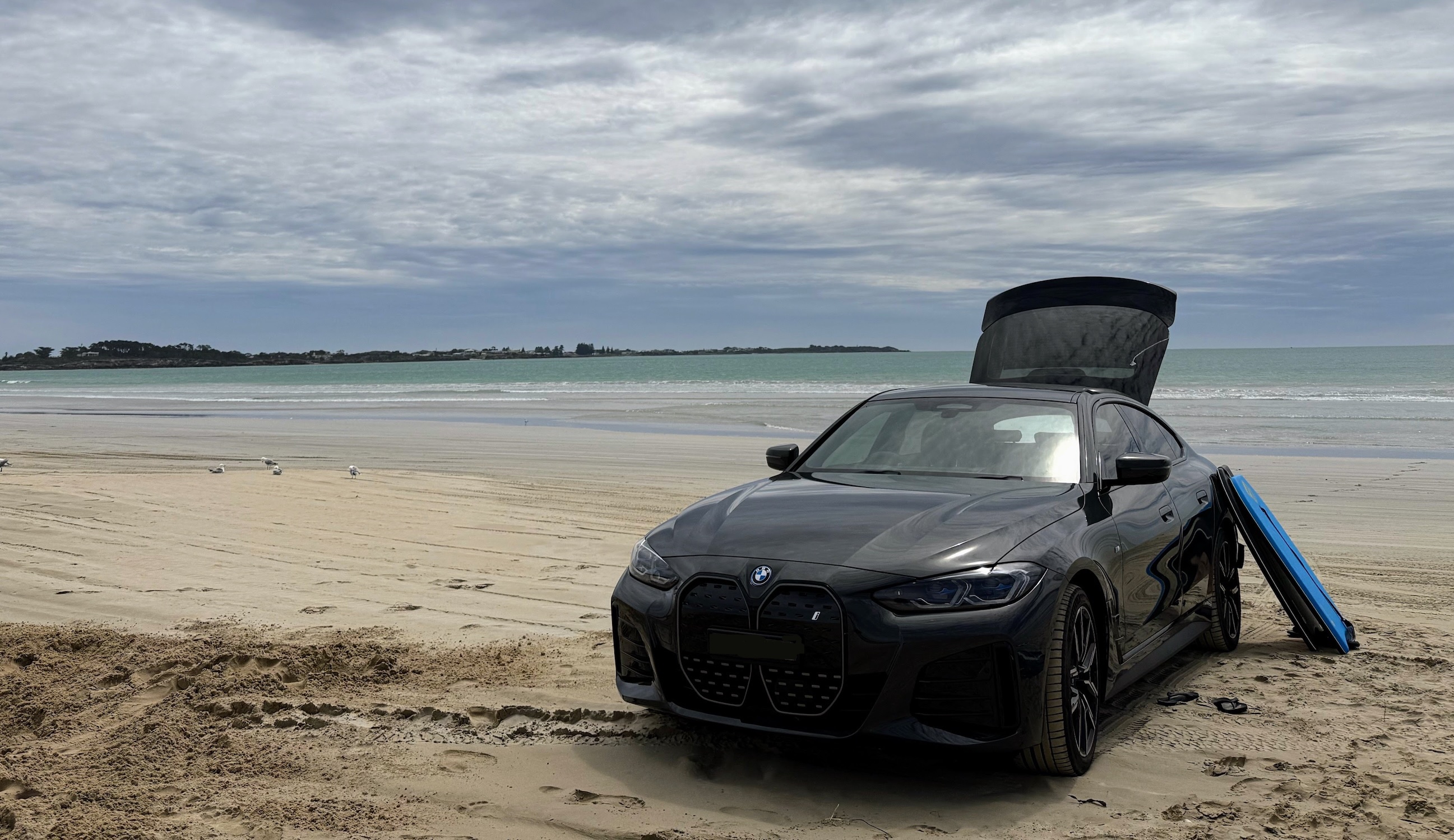
And finally, just to prove that some things never change, I did indeed take it to the beach. Because cars love sand and salt and you can't tell me otherwise.
I Did A Thing!
In the Year of Our Lord™ 2025, I finally moved my blog off of WordPress. It's now on GitHub Pages. I'm sure you're just as excited about that as I am!
Now, to answer your super important questions!
Does this mean you'll be blogging again?
Dunno.
What was it like to not post for 2 years?!
🤷♂️
Did you just put an emoji into a blog post? What are you, 50?
Not yet!
What happened to your very chique and definitely not out of date theme?
Yeah that's gone. I'm still learning all about the world of Jekyll Themes and am very, very lost. Maybe one day this site will look good? Maybe you're reading this in 2027 and laughing. Who knows. Life is a mystery wrapped in a taco.