In a previous post I covered the widely held myth that is Android screen size fragmentation from a developer perspective. Consider it required reading before you proceed.
Today famed Apple blogger John Gruber, posted his thoughts on what the iPhone 6 could look like when it launches. He suggests that both the rumoured 4.7" and 5.5" models might exist, and takes a guess at their screen resolutions:
- 4.7-inch display: 1334 × 750, 326 PPI @2x
- 5.5-inch display: 2208 × 1242, 461 PPI @3x
John Gruber, Daring Fireball, Conjecture Regarding Larger iPhone Displays
The whole post is worth a read, so off you go. I was interested in taking the same 1x (or 1pt/1dp as it's also known) diagram we drew for Android, and redrawing that for iOS in light of this post. It would look like this:
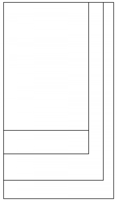
Remember our Android one looked like this:
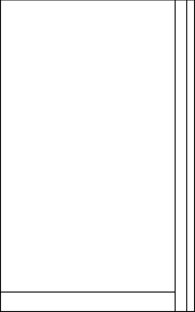 This comes from these 4 screen sizes:
- 320x480 @1x iPhone 4
- 320x536 @1x iPhone 5
- 375x667 @1x iPhone 6, 4.7"
- 414x736 @1x iPhone 6, 5.5"
What does this mean in practice? It means iOS developers will now have to do more work than their Android counterparts in order to support the increased variation in iOS screens. The best tools for that exist in iOS 8, which also makes it likely a lot of apps will go iOS 8 only to avoid the manual layout pain. It's not all bad news though, this might actually result in better large screen iOS apps vs their Android counterparts. This is because on the 5.5" iPhone there would be more content being shown, rather than everything just being bigger.
All of the above is based on rumours though, so we all have to wait until September to see what actually happens.