Fellow Relay FM host Jason Snell wrote an interesting article comparing Google in the naughties to Microsoft in the 90s.
Open Google Docs for iOS and you’re whisked into a Material Design world. To create a new document, you must tap a large red circle at the bottom right corner of the screen. The options icon is three vertical dots, rather than the three horizontal dots favored by Apple. Menus display in Material Design style, white cards on a gray background.
He argues that much like Microsoft was in the 90s, Google is now pushing a design language that is common across platforms and that in contrast Apple isn't (as evidenced by Apple Music on Android). While I agree with some of what Jason is saying, I feel as if he's so dangerously close to an epiphany. I'd argue that all the big companies now have their own design languages that they push across all their platforms, and that Google is the only one to actually give it a name.
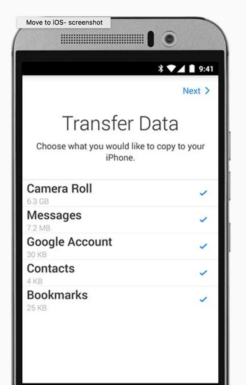
Allow me to elaborate. Every time I head to iTunes Connect or iCloud.com I'm presented with web apps that look like iOS apps. We have iOS launcher style icons on blurred backgrounds, we have iOS style navigation, heck we even have pop-up boxes to notify you of events and errors. Everything about these 'web apps' screams iOS. So it would be easy for me to pen an article about how Apple doesn't respect the web, or Windows. But they respect Android, right? Their music app changed 2 icons on the player screen! It turns out Apple actually have a huge sample size of 2 apps, which we can look at to see if they respect the Android platform. Here is the second one:
 Fits right in on Android. Totally.
Yes readers there's nothing the least bit iOS looking about that app. At all.
The truth is that Apple has a design language that they have chosen and they are applying it everywhere too. They haven't named it 'Apple Design' or 'TiLTOWB' (Tiny Light Text On White Backgrounds) but it's there, everywhere you look. Microsoft does the same, they have their 'authentically digital' design aesthetic that you see on Windows 10, Xbox, iOS and elsewhere.
So yes, Google is trying to apply Material Design to all platforms, but so is every other big tech company out there. Apple does it. Microsoft does it. Spotify does it. Facebook does it. As to whether they actually should, or each company should develop a unique aesthetic for each platform, well that's another debate entirely.