One of the benefits of being curious about technology and running a company where we get to buy it to test on, is that I get to play with a lot of cool gadgets. When it comes to watches alone I have the Apple Watch, LG G, LG Watch R, Moto 360, Samsung Galaxy Gear and the Sony Smartwatch 3. I thought it might be interesting to compare Android Wear and Apple Watch as they are today.
Hardware
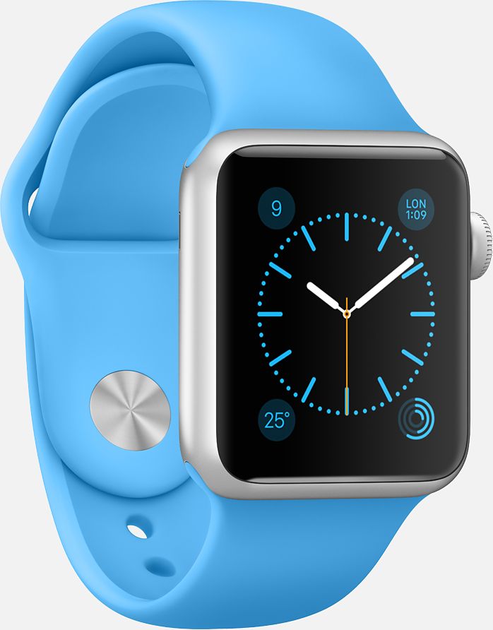
Hardware wise nothing matches the build quality of the Apple Watch. The way the bands work, the level of finish present in the body, stunning. There is only one body design, in two sizes, which you can customise with different bands. I personally don’t find the rectangular design of the Apple Watch appealing. It’s not ugly by any stretch, more just unassuming. That makes sense, if you only have one watch you have to make it unassuming to match all the different bands people might choose.

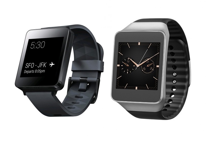
Android Wear watches on the other hand are cheaper and vary wildly. The LG G and Galaxy Gear were the first two out of the gate in June of 2014. Both chunky and square, they feature designs only their mother would love.

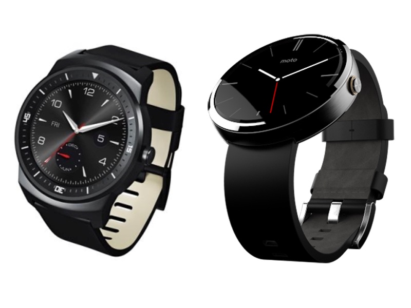
The Moto 360 and LG R on the other hand reference more traditional watch vocabulary and opt for round designs. The 360 looks like a watch from the future, while the LG R tries very much to blend in as a watch from the past.

None of the Android Wear watches are built to the same standard as the Apple Watch, but for me they have one huge advantage: you can pick the style you like best. Personally I prefer the LG R because when I put it on, it looks like a watch. Apart from its size, it’s unassuming and most people don’t comment on it because it looks like a regular watch.
One important thing to note: if you have small wrists and don’t like huge watches, all but Apple’s 38mm watch are not for you.
Hardware
Between all the watches listed above there are 3 different screen technologies being used: OLED (Apple, LG R, Samsung), LCD (LG G, Moto 360) and Transflective (Sony). Out of the current crop the Apple Watch stands head and shoulders above the rest. It’s clear, easy to read from any angle and bright.
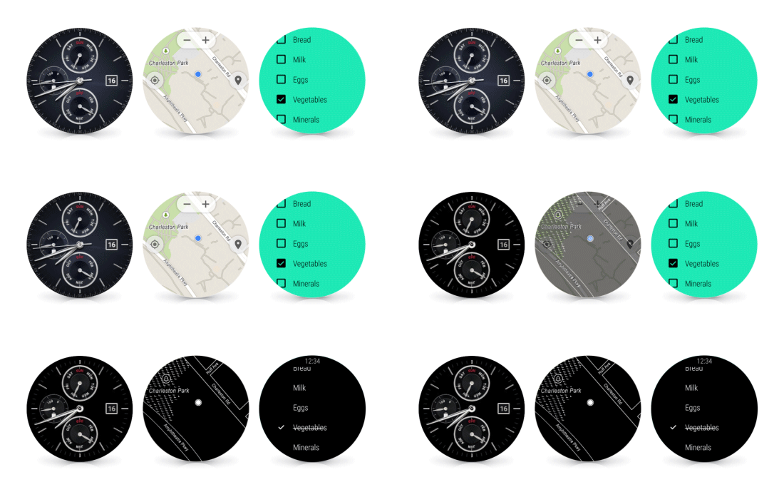
When you’re not using the Apple Watch, the screen turns off. You can tap a button, tilt your wrist or tap the screen to turn it on. Android Wear on the other hand has an ‘ambient mode’. This means when you’re not using it you can still see a low power version of the information it’s currently showing.

Once you have ambient mode and can read the time and your latest card at all times, it’s really hard to go back. I’d bet good money that Apple will introduce this feature to Apple Watch in the future.
Modes
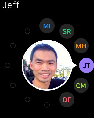
The Apple Watch feels like a small iPhone on your wrist. It has a watch face, from which you can pull up for glances, down for notifications. Press the digital crown and you’re on the home screen covered in tiny app circles. From here you can launch pre-installed apps and any third-party apps that have watch apps inside them. That’s assuming you can hit those tiny tap targets, I’m still missing and launching the wrong app all the time. There’s a dedicated friends button that brings up a list of contacts you can message. In terms of interaction models: you can touch it, force touch it, swipe up, swipe down, press the two buttons and scroll the digital crown. All in all there are a lot of ways to interact with this watch.

Android Wear on the other hand is much simpler. Your home screen is your watch face. Cards appear at the bottom Google Now style when they are relevant. Playing something? A playing card appears on top. Upcoming meeting? A card appears telling you before you need to leave. You can dismiss a card by swiping it away. Pull the cards up to reveal more details, and swipe right to take them full screen. Apps are available too, in the latest version you tap the screen to bring them up.

Notifications
Both Android Wear and Apple Watch let you configure which apps show notifications on your watch. By default both mirror the notifications you’re getting on your phone, to your watch. On Android Wear any notifications you dismiss are dismissed from your phone. On the Apple Watch this only seems true of iMessage and a few other select apps.
Both platforms feature actionable notifications, and these are supported on the watches as well.
Philosophies
Like a small iPhone on your wrist, the Apple watch is all about configuraiton. Pick the watch face you want from the list of predefined ones that come with it. Customise the watch face with complications. Choose your glances and their order. Select which apps do and don’t go to the watch, and sort those apps. It’s very much up to you to set it up in a way where all the glances and apps you need access to are in a familiar spot. Then it’s up to you to pull up those glances and apps when you need them.
Android wear of course lets you choose and customise watch faces too, you can even download third-party ones from Google Play. Watch faces aside though, Android Wear is very much Google Now for your watch. It tries to bring relevant information to you, at the time it thinks is appropriate. You don’t really set it up, you don’t customise glances, things just come to you. This can be an amazing experience, like when my sister visits me from interstate. A few hours before she lands her flight details appear on my watch and it tells me when I need to leave. I didn’t configure that, it automatically found her itinerary in my email and knew how to parse it. At times it feels like magic. It’s not always great though, often when I’m out somewhere it will tell me how long it takes to get home, something I don’t care for. Other times it knows I’ve googled a nearby business and will give me a card with directions to get there, even though I have no intention of going. It’s a machine trying to guess what you need, and with that comes both the magic of when it gets it right, and the annoyance when it’s wrong.
Voice Input
Both watches feature really robust voice input that seems to understand everything I say. In the case of the Apple Watch this surprised me the most, since just last year Siri could barely understand a word I was saying.
Messaging
Apple felt that contacting your friends was so important they put a giant button on the side of the watch for it. Pressing it brings up a predefined list of your favourite people who you can send weird 3D renderings, digital touch messages or just plain old text to. I’ve lost count of the amount of time I pressed that thinking it was a home button, but eventually my fingers learned that it wasn’t. So far I’ve only found this useful for scaring people with crazy looking 3D tongue guy, or sending and receiving crude pictures of human anatomy (yes, I am indeed a 5 year old). This feels like a novelty that most people won’t use past the first few weeks of having the watch. Drawing on that tiny screen is just too hard and there’s zero indication given as to if the message has been sent, or the other person read it.

Google seems to think this is important to, and in the latest update of Android Wear it lets you message your recent friend list either by dictating text, or drawing emoji which it will then interpret. Again, not super useful for me, but your mileage may vary.
On both platforms the only messaging feature I do use is occasionally replying to a message using voice to text. It’s handy in a pinch when you don’t have access to your phone or don’t want to pull it out of your pocket.
Good Vibrations
When a notification comes in, the Android Wear watch vibrates. The vibration feels like a phone, a shaking of the device that’s hard enough that you know something is going on. You can hear the vibration too, just like on a phone, but there’s no speaker that makes noise.
The Apple Watch vibrates a lot differently. Dubbed the ‘Taptic Engine’ it does what can only be described as a gentle side to side movement of something at the base of the watch. It doesn’t feel like someone is tapping you, but more like the watch moved on your wrist. The vibration itself is almost silent, you can’t hear it happen. Out of the box the Apple Watch also plays notification sounds from its speaker, like pings when receiving an iMessage. You can turn these off in the settings. I found the taptic style vibration to be a lot better because it was less violent, and not audible to other people. That said it is gentler, which led to me sometimes not even noticing it had happened, even when I turned it up all the way.
Fitness
Both watches can track your steps, elevation and heart rate. The main differences here is that Apple’s built in Activity app seems more polished and useful. That said it has some version 1.0 bugs, like telling me to stand up when I’d already been standing for the last 20 minutes.
The Sony Smartwatch is the only one with a built in GPS, so that you can accurately map your run without needing your phone. The rest can do the same if your phone is on your person, which considering the size of phones these days is becoming less and less practical.
Both platforms sync with an information database of your health data. Apple with ‘Health’ and Google with ‘Google Fit’.
Final Thoughts
The point of this article wasn’t to review the two platforms and tell you which one is better. I simply wanted to highlight the interesting differences between the two. In any case, Android Wear watches only work with Android phones. Apple watches only work with iPhones. This means if you want a smart watch you don’t actually get to choose between the two platforms, unless you want to swap phones as well.
