Here We Go Again

Ever feel like you’re getting old, and the same themes come up again and again? This week it’s the unsustainability of being an independent developer. Some idiot I follow wrote about this in 2011:

Before we got featured by Google on the Android market place, we were about a month away from having no money whatsoever. I’ve talked to many indie developers in Australia, and they are universally in the same boat. Some have taken on client work to try and fill the gap, others are working from home trying to minimise every expense they have. And I’m talking about the successful ones, the companies with great apps that have done well.

Russell Ivanovic, ‘You Guys Are Millionaires Right?’, November 2011

That post is worth a re-read, even if Russell is a “butt-hurt Android fanboy”. Don’t judge me, I read it on Reddit so it must be true. In 2014 though it’s Matt Gemmell:

The implacable, crushing wheels of industry, slow to move because of their size, have at last arrived on the frontier. Our frontier, or at least yours now. I’ve relinquished my claim.

Yes it’s another Gold Rush analogy, I never grow weary of those.

If Gold Rush analogies aren’t your thing, Chris Adamson has rough seas and ports instead:

For the first time in over a decade, I’ve been applying to permanent gigs, when they come up and when they’re willing to work remote (few are, but at least for now, I can still take my time). There’s no way I’d move my family to California, but I’m willing to give up a significant degree of career independence, because it increasingly seems untenable.

Chris Adamson, Any Port in a Storm

It wouldn’t be an Internet themes roundup without my new best friend, Marco Arment:

But I haven’t given it a deep look yet, so this all could just be the out-of-touch ramblings of a 32-year-old who’s already tired of learning new languages without a compelling reason.

Marco Arment, linking to Ed Finkler

So to summarise:

  • Independent developers are tired, grumpy and old
  • We can’t make money anymore
  • All my friends are dead
  • The sky is falling

Sarcasm aside, being independent has always been tough. It was tough in 2008, it was tough in 2011 and it remains tough in 2014. On the Australian weather front our own Bureau are building free mobile apps to compete with ours. In the podcasting space new apps are arriving every day, and the latest wave of them are VC funded, business models be damned ones. That doesn’t make the future rosy, but you won’t see me sailing my ship into a harbour or putting away my pickaxe. We’ve always said from the day that we started Shifty Jelly that we’re developers first, everything else second. We’re not iOS developers. We’re not Mac developers. We’re not Android developers. We’re not web developers. We’re just developers. I don’t really give out advice, but if I did that would be part of it. Forget the platform wars and follow where your customers are. I think too many single-platform developers don’t understand this simple idea.

Don’t get me wrong, I too dream about one day joining Google and building out Google Podcasts, the one true podcast platform to rule them all. I dream of no longer caring about day-to-day business things and just developing in the safety of a large organisation. But this indie thing is fun because it’s hard. It keeps you sharp. It means you have no choice but to stay focussed. And you know what? I love it, and wouldn’t give it up for the world. I look into the abyss, directly into our competitors eyes, and I say “bring it”. I even add a little profanity to the end of that sentence when I’m in the right mood.

The Android Screen Fragmentation Myth

As someone who develops for Android and iOS I get asked the same question over and over again by people: “Is developing for Android screens a huge pain? How on earth do you cope with the thousands of screen sizes available?”. Occasionally, they point me to infographics like this one courtesy of OpenSignal showing screen size fragmentation on Android in 2013:

Screen Shot 2014-07-05 at 4.41.04 pm

The answer tends to surprise pretty much everyone: It’s not that hard, and honestly causes us less headaches than most people imagine. Firstly, the tools Google give us to lay out interfaces have supported this from day one. You’ve been able to define one or more layouts that scale to various sizes, and if you want to get everything perfect, you can have as many of these layouts as you like, while still keeping the one codebase. The layouts are XML, and don’t live in your code. If you’re an iOS developer they are pretty much the equivalent of XIB files with size classes like iOS 8. The other part people don’t realise is that Android has standardised on screen resolutions for a long time now. To give you a sample, I chose the top 10 most popular phones from our Pocket Casts stats, and added the LG G3 with its crazy new resolution:

LG G3: 1440×2560
Nexus 5: 1080×1920
Galaxy S5: 1080×1920
Galaxy S4: 1080×1920
Galaxy S3: 720×1280
Galaxy Note 3: 1080×1920
Galaxy Note: 800×1280
HTC One M8: 1080×1920
HTC One M7: 1080×1920
Nexus 4: 768×1280
Moto X: 720×1280

Seems like a lot of variation, right? The part that might confuse most non-developers, is we lay everything out at ‘1x’ or ‘1dp’. So on the iPhone you can have a 320×480 pixel iPhone 3G, and a 640×960 iPhone 4, but the interface itself doesn’t change, it’s still 320×480. You don’t have to re-lay out any buttons or do a custom interface for it. All you do is provide higher resolution assets to make things look crisper. The same is true on Android. Take the above devices, and break them down into their 1x/1dp forms:

LG G3 @ 1x: 360×640
Nexus 5 @ 1x: 360×640
Galaxy S5 @ 1x: 360×640
Galaxy S4 @ 1x: 360×640
Galaxy S3 @ 1x: 360×640
Galaxy Note 3 @ 1x: 360×640
Galaxy Note @ 1x: 400×640
HTC One M7 @ 1x: 360×640
HTC One M8 @ 1x: 360×640
Nexus 4 @ 1x: 384×640
Moto X @ 1x: 360×640

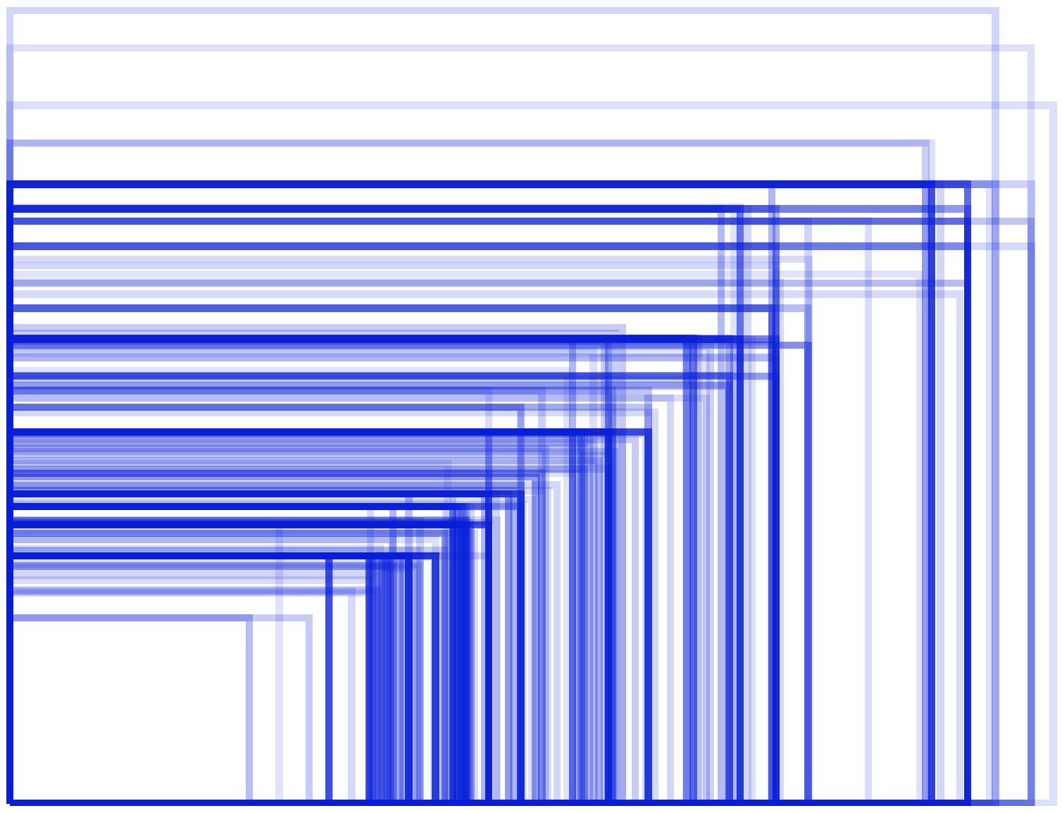
There’s no voodoo here, once you break things down into how you’d actually lay them out, there aren’t that many variations. There’s a slight variation in width, and there is in height as well, since some devices have software buttons that take up space on your physical screen. In Android 4.4 and above you can include these buttons into your interface, but for simplicity let’s just assume they take up that bottom space. So let’s redraw that commonly circulated diagram in terms of actual screen resolutions we design for on Android:

screen_res

The above are literally all the phone sizes we test, support and deploy on. There are of course other phone resolutions and aspect ratios out there, and in the early days of Android there was a lot more experimentation going on with these. For modern apps like ours though, which support Android 4.0 and above, the landscape is much nicer. That’s the beauty of Android’s massive market share, we can ignore all the people with phones running Android 2.3, those with odd and rare screen sizes, and target only 4.0 and above. The resulting group of people is comparable, if not bigger, than the users we target by being iOS 7 only in our iOS apps.

Don’t get me wrong, fragmentation certainly exists in Android, but screen resolutions and sizes are not the main issue. The above diagram and analysis also only take into account phones, not tablets, where designing for physical screen size becomes more important than resolution.

I/O Thoughts

This year was the first time I’ve attended the Google I/O conference, and it was a fascinating experience. As someone who is primarily an iOS developer and has been to WWDC before a lot of things about the way Google ran their conference fascinated me. I thought it might be interesting to briefly share some of those.

Developer Reps
Before the conference we worked heavily with our developer representatitves at Google, and at the conference I met many more representatives from around the world. What immediately struck me is that for the most part they were technical 20-40 somethings that knew how to code. They were also extremely prompt at passing on any questions they didn’t know the answers to and getting responses from other engineers. I personally prefer this approach of having technically minded engineers who understand code, helping you with every aspect of what you need as a developer to be successful.

Perhaps it’s just the ones I’ve met at Apple, but I’ve never had this experience before. Our developer rep is a nice guy, but he’s not the least bit technical, and in general I could only talk to him when he contacts me. I say ‘could’ because ever since we’ve had success on the Android platform he’s made it very clear that his services are no longer available to us. Perhaps that makes me bitter and jaded about the Developer Rep experience at Apple, but if you ask me it’s justified.

General Attitudes
One of the first things that struck me was the contrast between the kind of people that attend I/O vs those at WWDC. Granted in both cases I didn’t meet all 5000 attendees, so there’s nothing scientific about what follows. That said everyone I met at I/O was open-minded and tended to work on more than one platform. As such it wasn’t the least bit strange when someone pulled out their iPhone to check something on it. The majority of phones there seemed to be Androids, with the Nexus 5 making up the lions share of the devices I saw. What I’m getting at, and let me put it bluntly if I may, is that it highlighted just how insular and superior a lot of Apple developers act and feel. If you don’t believe me, just join a group of them at WWDC and whip out your Android phone. Within moments, you’ll wish you had whipped out something less offensive, like your genitalia instead.

This attitude is also reflected in Google Employees themselves. None of them care what phone you use, what laptop you choose or which platforms you develop for. They are actively interested in what things they can improve to make developing on their platforms better, and they are quite happy to acknowledge when a competitor like Apple or Microsoft has done something good. They are of course still insanely proud of their platform and will tell you about all the things they prefer or think they’ve done better than their competition. Overall they just seem more balanced, you can tell that what Apple is doing doesn’t keep them up at night. Having met a lot of Apple employees, I can’t say the same is true on the other side. They seem overly obsessed with Google, and are insanely sensitive should you bring the topic up, or deity of choice forbid, you actually develop on a Google platform.

The Keynote
Definitely not up to Apple presentation quality, and I’m not sure they needed any of that “I’m debugging a web service” stuff at the end. That said the first 45 minutes actually flowed well and Sundar Pichai gives off a really comfortable, friendly vibe from the stage. I’m undecided as to whether all the live demonstrations they attempted were brave or foolish, but I’m leaning towards that second one. They could have been just as powerful done as videos, or where the actual results were simulated rather than run live over the network.

The Actual Announcements
I’ve followed Google for a while now and what always struck me about their I/O announcements, and their entire product line is that it was very divisional. One division would make Chrome OS, another Android, another Google TV. From the outside at least those divisions seemed to share very little, in terms of vision, or even implementation. The end result, when presented at something like I/O felt like a disparate set of sometimes slightly overlapping services and products that just wasn’t that compelling. This year however was different. What I saw was a unified Google, finally getting its act together. Android is now clearly their platform of choice, it runs on TVs, cars, phones, tablets, watches and in your home. The same OS, different screens was their message.

I’m not sure how many people who only watched the Keynote or read blogs picked up on this, but this is a new Google. It’s hard as someone who follows Apple not to see the parallels in what happened there over the last few years. Gone is Scott Forstall and with the gentle but firm guiding hand of Tim Cook there’s a more unified, more collaborative Apple. Replace Scott Forstall with Andy Rubin, Tim Cook with Sundar Pichai and you have the same thing playing out on the other side of the pond. Sundar has united all those divisions into one coherent functional team with one common vision. Talking to various Google Engineers at the event it was clear they all had the same sentiment.

In previous Google keynotes there were always things announced that you knew were going absolutely nowhere, but this year that changed. Android ‘L’ preview is an amazing OS, with great visual design that excites me about the future of that platform. Android Wear is a really good 1.0 implementation of what I personally want in a smart watch. Android TV looks like the platform I’ve been begging Apple to build for the last 3 years, and while I have to reserve judgement until it comes out later this year, I’m excited about it. Android Auto is something I want in my car right now, it’s just that good. Perhaps if you had to pick one thing that is a “that’s nice, but let’s wait and see” it would be their Android in the home implementation. Much like Apple’s HomeKit it all comes down to how many hardware vendors actually adopt it before it becomes useful.

The Swag
Another obvious difference between I/O and WWDC is the free swag that Google hands out. They saddled me up with two Android Wear watches (a choice of the LG or Samsung versions, and also the Moto 360 as well when it ships), an Android TV unit and an odd but fun cardboard box that you can fold up into a VR headset. It felt like being in the audience of an Oprah show: “AND YOU GET A WATCH, AND YOU GET A WATCH” while the crowd goes crazy. From a selfish perspective this is really cool, though I do wonder if it drives up demand for tickets that are already in short supply to a conference like this. I didn’t meet any non-developers at the conference, but it wouldn’t surprise me if some people apply for a ticket just to try and score some free hardware. After all just doing the mental maths that’s about $700 worth of hardware that they are giving out.

Last But Not Least
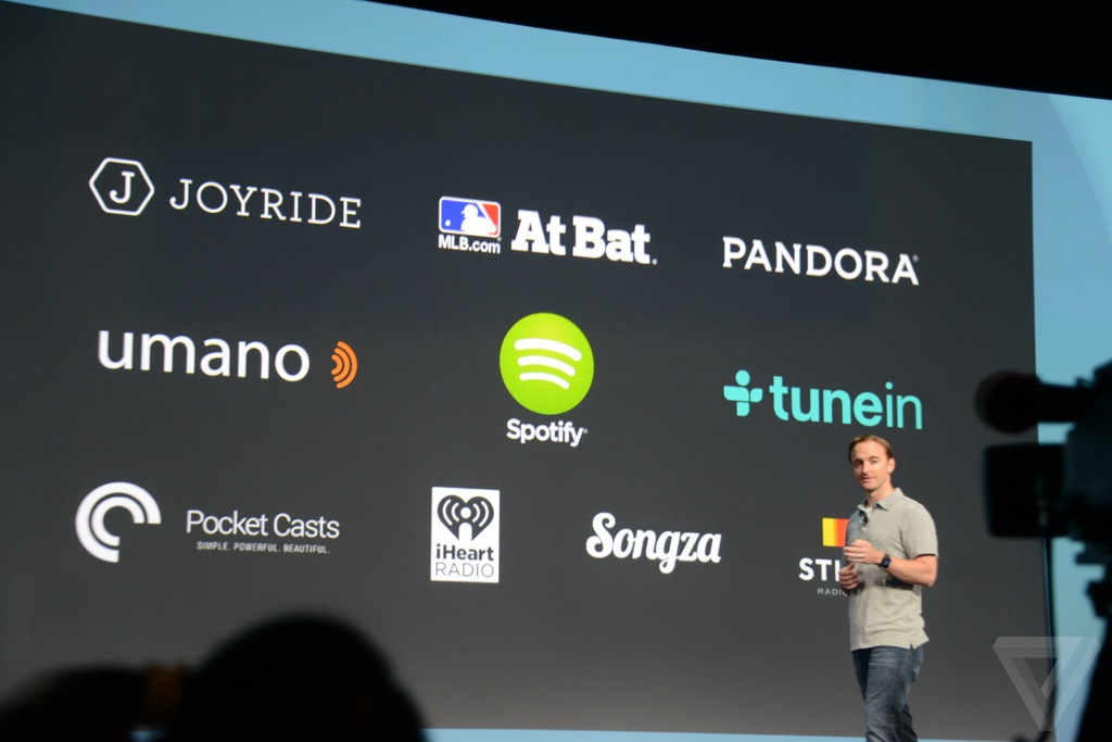
WE WERE FEATURED IN THE KEYNOTE! That’s right, little old Shifty Jelly had Pocket Casts announced as a launch app for Android Auto:
Keynote_slide

I can’t begin to tell you what that was like, or how amazing it was to sit in an Audi and watch someone demonstrate our app as part of the Android Auto experience. As a developer, these are the kind of things you live for, seeing your app get into the hands of millions of people in new and unique ways. Before the conference we’d never seen the actual hardware or interface our app would run on and I was genuinely thrilled to see that Google had done an amazing job of it. In my opinion it’s far superior to the Apple’s Carplay both in terms of interface and the other two major parts of having Google in your car: Google Maps and Google voice recognition. I think you’d be hard pressed to find even the most hard core Apple zealot who would try to argue that Google is not killing it in both those areas.
Android Wear – From an Actual User

I won’t lie to you, whenever my timeline fills up with negative articles about new technology from people who haven’t even touched it, I die a little inside. I get that the sports team you’ve chosen to support didn’t release it. I get that all other sports teams are not as good as yours. I get that you view everything your sports team does in a positive light, and everything the opposing teams do in a negative light…but you know these aren’t sports teams right? They are companies.

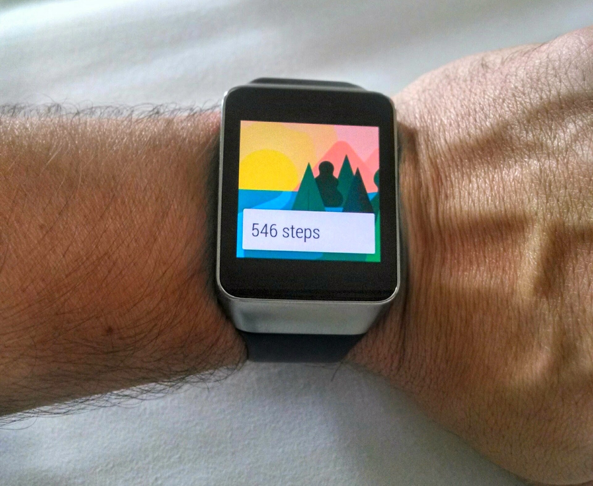
Anyhoo Android Wear! I’ve been using the Samsung Gear Live while I wait for my Moto 360 to ship. Here it is on my hairy man wrist:

watch 1

I should prefix what I’m about to say with the fact that I had a Pebble before this. To me the Pebble was extremely ugly, but the utility of it made me happy to wear it all the same. I was able to see who just texted me without pulling my phone out of my pocket, and do things like control my podcast playback without touching my phone. Android Wear takes this to the next level. When paired with my Android phone it shows me cards from apps that are currently running, as well as things it thinks I need to know about. It’s basically like Google Now for your wrist, with the added benefit of being able to get notifications from your phone.

I’ve seen people complaining that all this does is turn your wrist into a buzzing, annoying mess. These people clearly either haven’t tried one, or didn’t bother to spend 5 minutes setting the watch up. If you buy an iPhone today, install 100 apps, and say yes to every notification you possible can your phone will vibrate all day every day. This isn’t a mistake on Apple’s part. Their phone is not a huge pile of fail. It’s why Apple gives you the choice about which notifications you do and don’t want. Android Wear is no different. By default any notifications that appears on your phone, appear also on your watch. For me this is perfect, I’ve already configured my phone to only show notifications for things I deem important. This means that during a typical day I glance at my watch maybe 10 times a day. I can see instantly why the phone in my pocket vibrated and choose whether or not I need to do anything about it. This is the promise of Android Wear, it liberates me from having to interact with my phone at all in most cases. If I had wanted to, I could also have configured an even smaller subset of notifications, because the Android Wear app on your phone lets you choose additional apps to ignore notifications for.

The watch also tracks my step count, and can read my heart beat. The step count seems fairly accurate and is a handy, interesting thing to know. The heart beat doesn’t really excite me (har har) at all, but it’s there and works. You can respond to text messages by voice, and being Google’s implementation of voice recognition it works amazingly well. Personally I’m not comfortable talking to a watch in public, so I use it in a much more passive way. My pocket vibrates and I look at my watch, it’s a text from my wife. Later when I sit down I respond to it. My pocket vibrates and this time it’s a Twitter notification, so I just swipe once to dismiss it. My phone also clears the notification, since it knows I’ve dealt with it on my watch.

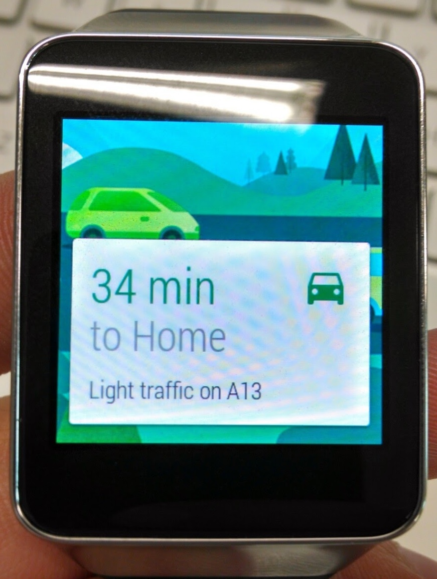
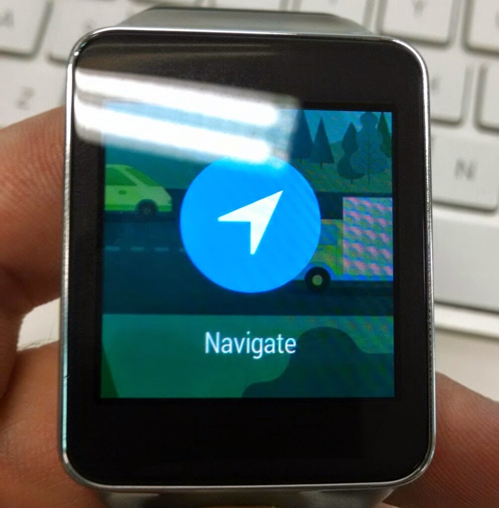
In terms of interaction models, there are a few nice gestures on the device. Pull down all the way from the home screen and it instantly mutes the watch. It means visually all you see is the watch face, and it will never show you anything else, or vibrate. Pull down again to go back to receiving notifications. Placing your hand flat over the face of the watch (in what I like to call the ‘ssshhh’ motion) instantly puts the watch back to the home screen and into its dim mode. The cards that appear can be swiped away if you don’t want to know about them, or pulled across for more information and actions. Here for example is the navigation card:

12

I’ve found that Google Now is insanely good at predicting the kinds of things you’d like to see when you’re visiting somewhere. It shows you the time back home, information about your flights and hotel and local attractions. It seems to know with eery accuracy when you’d like to know these things. For example on my last day at I/O it knew that I was flying out at 9.30pm, but checking out at 10am, so it suggested movie times at a local cinema to me. All of this is passively listed on the watch and is there if you want to interact with it. It doesn’t for example buzz when new cards appear, they just happen to be there when you glance. At home in a small town like Adelaide Australia these are slightly less useful, though it is still handy to know about traffic problems since I have the choice of 3 different routes back home.

Those hoping for a revolution might be disappointed, this feels like an evolution between Pebble and Android. For smart watch fans like me, this is a great thing. Google have the best smart watch available and it’s a huge leap over the Pebble I wore before it. Perhaps Apple will deliver a magical fairy watch full of unicorns later this year, but as my mate Grubes loves to point out, you shouldn’t ever review a shipping product against an unreleased one. For now Android Wear is so good it brings me yet again back to using the Moto X as my main phone.

Android Wear is still very much a 1.0 though. The current crop of watches are ugly, and there are some extra features I’d like that just aren’t there yet. Unlike an Apple product though, this isn’t what we’re stuck with for the next year until the next one. Motorola is making a very nice looking watch that I definitely want later this year, the 360. I got to play with one at I/O and wasn’t too pleased when I had to give it back to the Motorola rep that was there. HTC who also do some amazing industrial design have said they are working on one. This means that there will hopefully be a vibrant watch market with many different colours, sizes and styles to choose from. This mimics the market for $200+ watches as it is today. I guess the only way to end this article is to risk looking like a douche nozzle and quoting myself:

Android Annoyances, Chapter 1

I’ve been using Android full time for a few weeks now, and it has been an interesting experiment. So far it’s still my primary phone and overall I like it. That said there are some things that need fixing, and since my blog is about rants, here’s the first one: Permissions.

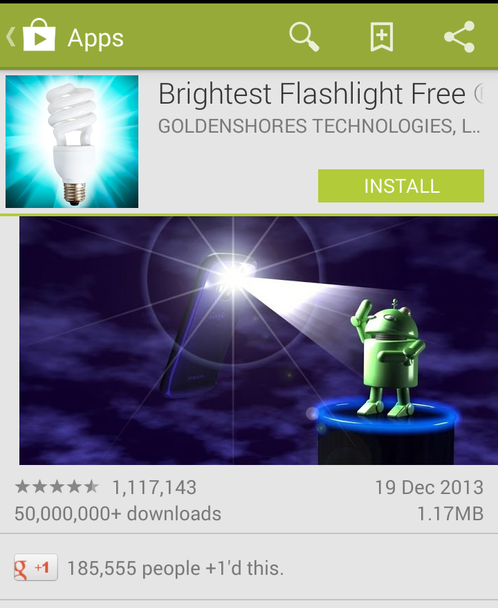
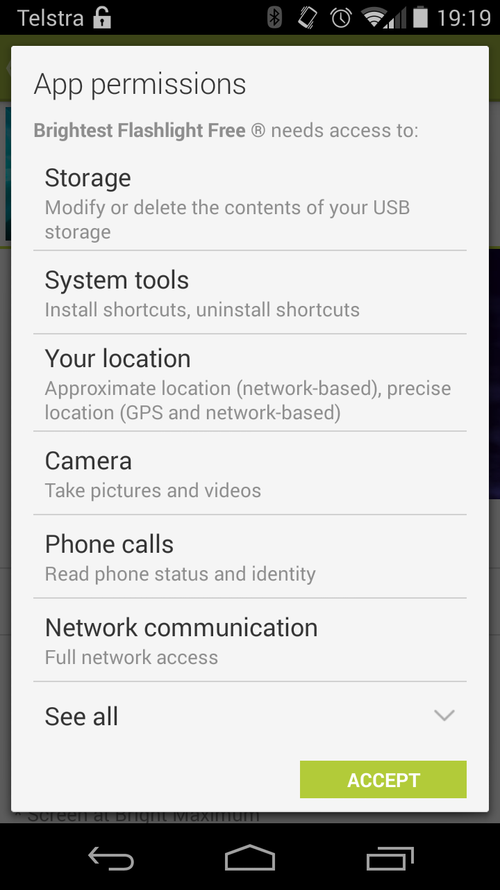
Android handles permissions differently to iOS in that it lets you know what an app can do at install time. It’s very similar to the way App Sandboxing works on modern OS X. A developer sets the permissions an app requires, based on a defined set of permissions that the OS provides. So far so good right? Yes, until it’s time to look for an app. Let’s for example browse for a flashlight app:

So Bright

Ok, this app has decent reviews, over 50 million people have installed it and hey, it’s the brightest!

Oh My TakeiWait what? This app wants to write permission to my SD Card, it wants to install shortcuts, access my location, get the ID of my phone and access the network? I mean I know it’s the brightest but all that seems a bit excessive.

Android fans will no doubt tell me that this is great, I’ve been saved from this horrible app that is trying to take advantage of me! That’s all well and good, but what happens when a must have app (like Facebook or Twitter) comes along that you really want to use but there are one or two permissions you don’t want to give it? On iOS, annoying popups aside, I can use Facebook but completely turn off its ability to access my location. On Android? Nope.

So why hasn’t this been addressed? The more cynical might say because Google wants to do bad things to you, and this gives them an air of having asked you for permission before they do. Really though frameworks like Google Play Services are so embedded into an Android device that Google already has access to almost anything they could possibly want to know about you. My guess is that they know introducing a way to deny these permissions will break a lot of apps and they don’t want to make waves if they don’t have to. I think they need to take a stand, after all it should be every users basic human right to deny Facebook access to their location. So much so that I’m off to make placards about it right now…who’s with me?