For those that know me, it’s a really poorly kept secret that my two favourite hardware makers in the world are Apple and Motorola. Apple just make amazing things, year in, year out. Sure their fans sometimes skew a bit annoying, and sure it’s baffling why people celebrate them making 50% margins on a phone, but their hardware is amazing. Motorola for me though, especially in the last few years has been a treat to watch. The company has fallen a long way since the lofty days of the Razr. Up until a few years ago I’d completely written them off as making bland, unappealing hardware with no soul.
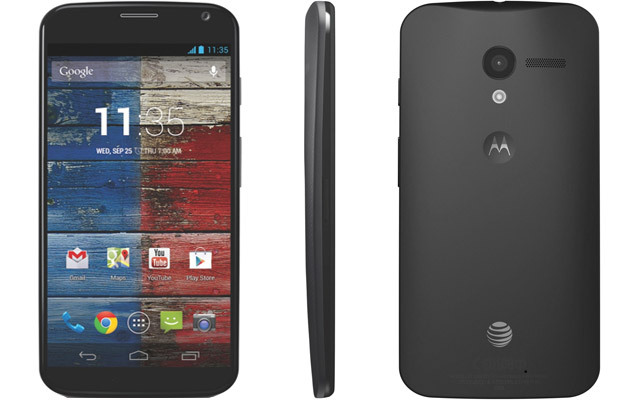
Then in 2013, something magical happened. The original Moto X.
This little phone was a breath of fresh air, not only for Motorola, but for all of Android. It was small, featured near stock Android and nestled perfectly into the palm of your hand. You could customise it using a new site called ‘Moto Maker’ and select different colour backs, fronts and even a highlight colour. It wasn’t just colours either, Motorola had the audacity to offer materials you wouldn’t really expect on your phone, like bamboo. While every other manufacturer was going crazy ‘skinning’ Android to make it look different, Motorola gave us the stock Android User Interface. While every other manufacturer was busy desperately trying to replace every app that came from Google with their own version of the same thing, Motorola instead opted to enhance the core parts of your phone experience in small ways. If the phone noticed you were driving a car, it would offer to read your text messages. If you twisted your hand twice, it would launch the camera app. It would even respond to ‘OK Google Now’ when your screen was locked and your hands were busy. It got so many things right, and restored Motorola’s status as a premium phone maker in a lot of people’s eyes.
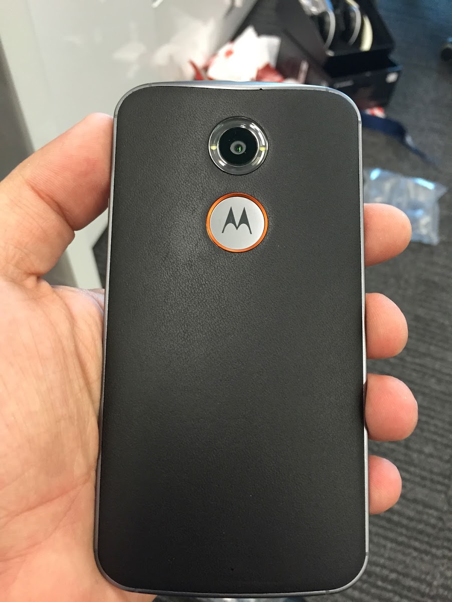
Fast forward to 2014, and Motorola launched the Moto X. Same name but a brand new phone. It was bigger, had a better screen and camera and introduced bold new colours and materials like leather. I was initially skeptical of them taking such a perfectly sized phone with a 4.7″ screen and increasing it to 5.2″ but in the end it proved to be a great move. I of course ordered mine, with a custom leather back and orange highlights:
I loved that this phone was round, like the iPhone’s of old that fit perfectly into my hand. I loved that it was grippy and didn’t need a case to feel like I could use it. But…if I’m being honest, one thing still bugged me. The camera. It was good, but it didn’t hold a candle to the one on my iPhone. In perfect conditions the photos looked the same, sure. On so many other occasions though, when the lighting was bad or the subject moved, the photos were terrible. So when the Galaxy S6 came around with its camera I shelved my poor Moto X and started using that instead.
So here we are, with me reluctantly using a Samsung phone…a company I really don’t hold much love for…when who should come along to save me but Motorola! At an event 2 days ago they unveiled the Moto X 2015. The event itself was a bit cringeworthy, but the phones announced were interesting. I’m going to put aside the Moto G, not because it’s not amazing, but because that could be a whole blog post in and of itself. That little budget phone that has redefined how a budget phone should look and feel continues to go from strength to strength. This year for the first time Motorola has opted for two models of the Moto X, the ‘Moto X Play‘ and the ‘Moto X Style‘. If you’re an Apple fan who doesn’t know much about Motorola you’ll probably assume this is a direct reaction to the iPhone 6 and 6+ lines that Apple sell. You’d be dead wrong. The Moto X Play isn’t even coming to the US and appears to be Motorola’s attempt at making a high end phone for the masses. At roughly half the price of an iPhone 6 and with some amazing specs in tow it’s going to be very interesting to see how its story plays out (sorry).
But I’m all about the Moto X. Motorola said all the right things at the event. They’ve improved the camera and the screen of the 2014 model. Battery life is better. They are sticking to stock Android with a few custom additions. There are more customisation options now in Moto Maker. So I should be ecstatic right? Well honestly…no. I feel nervous and worried. Worried that the phone has gone from what seemed like a perfect 5.2″ screen to a 5.7″ one. Nervous that Motorola might end up being all talk and no game when it comes to the camera. On the camera front it really will be impossible to know until people start testing it. Hands on time from sites like The Verge help, but really you can’t tell much about a phone by taking a few photos in a room. On the size front there’s side by side shots of the Moto X and the Nexus 6 (a phone I find uncomfortably big) and it’s definitely smaller. It’s also smaller than the iPhone 6+ (another phone I find too big). But is it small enough? I sure as heck hope so Motorola. I’ve been impressed with your last two devices and your comeback in the last few years. Please don’t let me down.

