I ended my mini Moto 360 review by saying:
Supposing however that you magically transplanted the screen, battery and processor of the Gear Live into this watch, well then I’d be throwing my money at you.
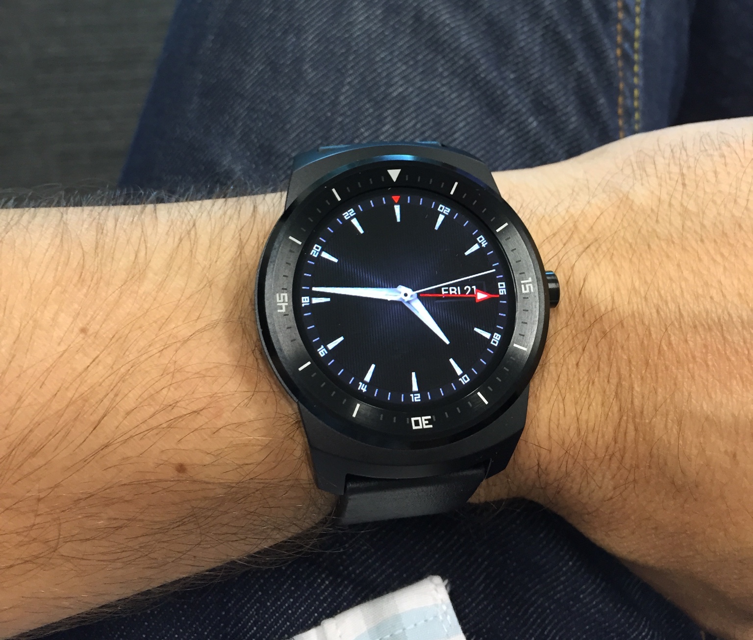
It occurred to me shortly afterwards that LG might just have done that, with the extremely awkwardly named LG G Watch R. So dear reader, for your sake and that of science I went ahead and ordered one. I’ve been using it for almost a week now and I’ve definitely formed a clear opinion about where this watch sits in the current landscape of Android Wear watches. The TL;DR would look like this: LG R > Moto 360 > Gear Live > LG G.
This watch gets a lot of things right:
- The AMOLED screen is great. Bright, clear and most importantly of all: visible in ambient/dim mode.
- The battery life is also good: 2 days in always on mode, with the watch never turning off. I haven’t even bothered to see how long you’d get with it going to sleep.
- In terms of looks it’s no work of art, but it does look the most watch like of all the devices I’ve worn. This means it doesn’t stand out on your wrist as a futuristic computer. If you like to fit in, this might be a plus for you.
- The screen is completely and utterly round, with no cut outs to be seen. Gruber hasn’t even seen fit to come up with a catch phrase for this watch, or even mention that it exists, that’s how round it is.
- Whatever processor is in there, is clearly the right one. I haven’t noticed a single bit of lag in any of the Android Wear UI like I did on the Moto 360.
But it doesn’t get everything right:
- The default watch faces are noticeably uglier and more tacky than those on the 360. Android Wear 2.0 is meant to address this by providing support for downloadable watch faces. In the mean time you’re left wishing that LG had even half of the design prowess that Motorola has.
- The screen is smaller than the Moto 360, and noticeably so. A lot of content gets cut off far earlier than on the 360, which is annoying.
- The charging cradle it comes with, while better than most, is not as nice as the Moto 360 inductive charger. It also means you need LG’s dock, unlike the 360 that you can drop onto any wireless charger.
- It just doesn’t look as nice as the 360. I know this is subjective, but the 360 feels like a class act sitting on my wrist. This just feels like a cheap-ish watch. I’ve talked to other people that completely disagree with me on this point though, so your mileage may vary.
My overall impression is that this watch gets a lot of things right. A bright, always on screen. A snappy, responsive User Interface. Decent battery life. If I had to recommend only one Android Wear watch, this would be it. That said if you’re on the fence, I’d really recommend waiting to see what the second generation of these watches bring. A lot of these watches, and even Android Wear itself, feel like products that are in a rapid transition phase. Personally I have a soft spot for Motorola and their superior hardware design and aesthetic. I really hope they nail it with the Moto 720…or One…or whatever they end up calling the next one.
