Ever ask yourself why I write so much about Android and so little about iOS? Go ahead, think about it. You're all pretty much wrong, except for you, well done to you that one person over there. I do so because iOS is covered to death in the press, and covered extremely well. My favourite site to go to for 'the most favourable coverage possible from the Apple perspective' is iMore. Rene (who I consider a good friend) is an artist. Is the iPhone 6 too slippery, too thin? Nope. It's a 'super slim core' which you get to stylise with the case of your choice. In case you're reading that as sarcasm, it's really not, I have a huge amount of respect for the guy. I read John Gruber's Daring Fireball for the more pragmatic 'Apple PR' type coverage. He tends to frame things slightly less positively but with just as much (if not more) inside knowledge of the inner workings of Apple. He'll throw things out as 'guesses'. He'll throw shade on the competition. The timing with which he does this is invaluable to study if you want to get a feel for the inner workings of Apple and their release cycles and processes.
The problem is that same press writes things that are just plain wrong about Android. Take for example John's article today about watch faces. He states:
...but clearly the Android Wear UI was not designed with black backgrounds in mind
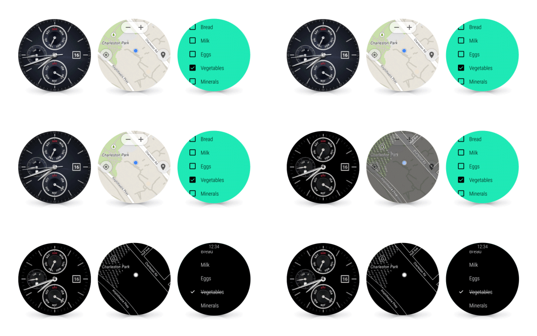
And this in an 'Update' no less, trying to clarify that Apple aren't the only ones with OLED displays in their watches. The reason he writes that is that I suspect he has no idea that my Android Wear watch spends 95% of its life in 'ambient mode'...which is all about black backgrounds for UI. Here's a gif showing watch faces and apps in 'on' and 'ambient' modes.

Basically if you raise an Android Wear device to see the time, the screen will light up and you'll be in 'on' mode. Watch faces are full colour as are apps in this mode. If you don't interact with them after about 5 seconds they'll revert to 'ambient' mode where the UI still runs, but with black backgrounds and only some pixels turned on. Animations are generally disabled in this mode as well. This is incredibly useful. It means you never end up in this situation:
and I started glancing at my watch every few minutes. But it was always off, because my wrist was already positioned with the watch face up
You can tell the time at all times, and with the newly released Android Wear 5.1, you can see your apps at all times too. What about battery I hear you yell? Well my G Watch R already gets 2 days of battery with this mode turned on. Yep, a full day more than Apple Watch.
And this kids is why I write about Android. I don't love all aspects of it, and I certainly don't hate Apple. I just can't stand when I hear inaccuracies like this repeated. Yes, you're right, I'm weird like that.