Remember back in June when Apple promised to bring their music app to Android in September? No? I do, because I was sitting in the keynote room at the time. My prevailing thought at the time was a simple one: "This is going to be fascinating. Will Apple try to clone their iOS app, or embrace Material Design, rise above pettiness and make something amazing?". There's two competing interests here of course, you don't need to be clairvoyant to know that Apple hates Android. That said they clearly know that in order for their music service to be successful, they need to be on the biggest mobile platform in the world, Android. I love this kind of conundrum and I'm fascinated by the direction they'll take.
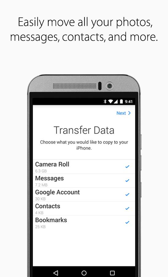
I don't know how much of an indication it gives you, but here's their first ever Android app, released today:
![]()
Ummm. Ok. That's not how Android app icons work.

Yeah. It's a poor attempt at making an Android app look like an iOS app. If you're being generous, you might think Apple did this to make you more comfortable about moving to iOS. You might even say they wanted it to look bad, because they want the amazing experience to be on iOS, not Android. Maybe. It's certainly one way to look at it.
If this is the way they go with their music app though, you'll know they let their arrogance and showmanship get in the way of the success of a great service. I sincerely hope they don't, and that this app is just a fun little diversion before their music app ships. The date seems to have slipped to 'Coming this Spring' so we'll have to wait a little longer, but I for one am fascinated by what they will do here.